Blog

Guide to Creating Interactive Dashboards in SAP Analytics Cloud: Effective Visualization Techniques
In an era where information floods in, the primary challenge for businesses is no longer gathering data, but transforming it into strategic action. Many analysts remain held hostage by stacks of tedious spreadsheets, despite the immense potential hidden within. Without accurate visualization, crucial company data is like sunken treasure at the bottom of the ocean without a map its value is extraordinary, yet impossible to excavate without clear clues.
With SAP Analytics Cloud, you can transform piles of raw data into vivid, interactive dashboards. This article will guide you from the basics to advanced optimization tricks to ensure every report you generate appears stunning, classy, and drives real business impact.
Data Preparation: Building a Solid Foundation
Before entering the design phase, you must ensure the "raw materials" used are ready. In the world of SAP Analytics Cloud, the quality of data visualization relies heavily on the Data Modeling process performed at the start. If the foundation is fragile, the displayed information will be misleading.
The first step is data cleaning. Ensure there are no duplicates and that formatting standards (such as currency and dates) are consistent. A key tip for maintaining performance is to discard unnecessary columns at the model level. The leaner the data you pull, the more agile your widgets will be in responding to commands. Remember, a tidy data model is key to keeping your interactive dashboard from feeling sluggish when accessed by multiple users simultaneously.
Designing the Layout: Choosing the Right Canvas
Starting a story in SAC requires strategic decisions regarding layout. You can choose between a rigid yet precise Canvas Page, or a flexible Responsive Page. In an era of high mobility, using a responsive layout is highly recommended. With this feature, your interactive dashboard will automatically adjust its display when opened on a tablet or smartphone.
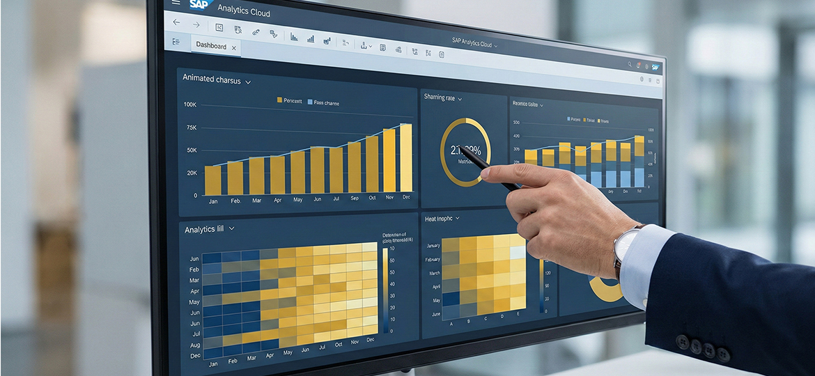
After determining the layout, select widgets based on function. Use Bar Charts for category comparisons and Line Charts to monitor trends over time. Avoid overly complex graphs if a simple bar chart can answer the business question. Effective visualization is visualization that can be understood by the audience in under five seconds.
Interactive Features: Bringing Data to Life with Intelligence
The core of an interactive dashboard in SAP Analytics Cloud lies in its ability to converse with the user. Don't let your charts remain static images. Use the Linked Analysis feature to create synchronization between charts; when a user clicks a region on a map, all other widgets will automatically adjust their data.
Additionally, utilize Input Controls as global filters to give full control to the audience. The most revolutionary feature in SAC is Smart Insights. Powered by AI, this feature provides automatic explanations for why a number spiked or dropped, so you no longer need to guess the cause behind a trend.
The "Breathing" Visualization Principle: Functional Aesthetics
Great visualization gives the eyes room to "breathe." Do not clutter the screen with too much irrelevant information (often called chart junk). Use color functionally; use high-contrast colors only to highlight key points, and neutral colors for other supporting elements.
Ensure there is sufficient white space or empty space between widgets. This empty space isn't wasted space, but a tool to prevent the audience's brain from tiring quickly while processing complex information. By maintaining minimalism, your data visualization will look far more elegant and professional.
Performance Optimization: Speed Under 3 Seconds
Even the most beautiful dashboard will be abandoned if the loading time is slow. To optimize SAP Analytics Cloud, enable the View Time Optimization feature. This ensures only widgets visible on the screen are processed first.
"Don't force all data onto one screen; stick to 6 to 9 widgets per page. If your list of metrics is still long, work around it with a tab system so the system workload doesn't pile up in one place. Furthermore, you can utilize 'Top-N' filters to summarize data appearing in charts—for example, displaying only the 10 best-selling products. This simple trick is very effective in making the system feel much lighter and more responsive."
Conclusion & Integrated Business Solutions
Building a professional dashboard in SAP Analytics Cloud isn't just about moving numbers into charts. It is a long process of excavating business narratives that have been hidden. But remember, no matter how sophisticated the visuals we create, their power ultimately depends on one thing: how synchronized and 'honest' the raw data flowing from the heart of our company system is in real-time.
If you want to optimize business operations while securing accurate data sources for analytics, consider using a robust ERP solution. Immediately transform your business with SAP Business One from Soltius for more perfect data integration and sharper decision-making.
Other News